
Open code
# Load required packages
library(here)
library(tidyverse)
library(ggplot2)
library(hockeystick)
library(kableExtra)
library(broom)Here is the link to the github repository where all of the data and code is housed:
On Halloween 1991, a massive blizzard hit Minnesota. This event has lived on in cultural infamy among Minnesotans. Of the 25 top snowfall events in Minnesota (from 1884-2023), only 5 of them occurred in the 21st century. There seems to be a trend away from high intensity snowfall events. This is a curious question: as the onset of climate change raises temperatures and increases the occurrence of extreme weather events, what does this mean for blizzards and intense snowfall events? Are there fewer intense snowfall events? Is that correlated to an increase in atmospheric CO2? And, if so, does that align with other trends we see in weather patterns?
As the general public becomes more worried about the reality of what a warming planet means for them, more research about how climate change might influence weather patterns is being conducted. There are studies analyzing what a warmer planet means for snowfall events, but these are mostly looking at worldwide trends. This analysis aims to see how this is working in Minnesota, a place where snow has a lot of cultural meaning.
In order to set up our notebook, we need to read in our essential packages. The packages needed for this analysis are here for reading in the data, hockeystick for accessing some of the data for this project, tidyverse and ggplot2 for cleaning, analyzing and visualizing the data, and kableExtra and broom for making our results neat.
# Load required packages
library(here)
library(tidyverse)
library(ggplot2)
library(hockeystick)
library(kableExtra)
library(broom)To examine these questions, we will need to gather some important data: extensive weather and precipitation data from Minnesota, atmospheric CO2 concentration data, and some information about specific snowfall events.
The precipitation data came from NOAA’s National Centers for Environmental Information. While this platform has a huge volume of data from all over, you are only allowed to request said data in 10 year chunks. Therefore, the chunks of data I downloaded were: 1985/01/01 - 1994/01/01, 1994/01/02 - 2003/12/31, 2004/01/01 - 2013/12/31, and 2014/01/01 - 2023/12/31. The weather station where the data was recorded was the Minneapolis Saint Paul international airport, which is located in Southeast Minnesota. Find this data, or conduct a search for any other weather station data, here.
The atmospheric CO2 data comes from an R package called hockeystick. The package is very robust with all sorts of climate adjacent information. This includes atmospheric CO2, methane, emissions, instrumental and proxy temperature records, sea levels, Arctic/Antarctic sea-ice, Hurricanes, and Paleo climate data. This is a very accessible way to begin making climate models with open source software. To get more information about this package, read the package’s documentation here.
To make analysis easier, when we read in the data, we are going to do some cleaning immediately. We will use janitor to transform all of the column names in the the weather data to lower snake case. The data also comes with a lot of columns and observations of weather phenomena, but we are only interested in the hourly precipitation data, so we will drop all other columns. Additionally, for a few of the data, the hourly precipitation data is not numeric, so we will make sure to change that column to be of type numeric.
# Read in weather data
# 1985/01/01 - 1994/01/01
weather_1985_1994 <- read_csv(here('posts/2024-12-13-msp-weather/data/85-94.csv')) %>% # Read in csv
  janitor::clean_names() %>% # convert column names to lower snake case
  select(station, date, hourly_precipitation) %>% # select only columns we are interested in
  mutate(hourly_precipitation = as.numeric(hourly_precipitation))

# 1994/01/02 - 2003/12/31
weather_1994_2003 <- read_csv(here('posts/2024-12-13-msp-weather/data/94-03.csv')) %>%
  janitor::clean_names() %>%
  select(station, date, hourly_precipitation) %>%
  mutate(hourly_precipitation = as.numeric(hourly_precipitation))

# 2004/01/01 - 2013/12/31
weather_2004_2014 <- read_csv(here('posts/2024-12-13-msp-weather/data/04-14.csv')) %>%
  janitor::clean_names() %>%
  select(station, date, hourly_precipitation) %>%
  mutate(hourly_precipitation = as.numeric(hourly_precipitation))

# 2014/01/01 - 2023/12/31
weather_2014_2023 <- read_csv(here('posts/2024-12-13-msp-weather/data/14-23.csv')) %>%
  janitor::clean_names() %>%
  select(station, date, hourly_precipitation) %>%
  mutate(hourly_precipitation = as.numeric(hourly_precipitation))
Reading in the CO2 data is much simpler, because of the hockeystick package in R.
# Read in emissions data
co2 <- get_carbon()Now that we have both our precipitation and CO2 data, we need to aggregate and filter the data for our analysis purposes.
First, we will combine the four chunks of weather data into one data set. Then we will take that combined data and aggregate it to get the monthly average precipitation. To do this, we need to pull out the month from the date datetime object, and then take the average in those specific month groups. To help with this analysis, we will add in a period column when we combine the data in order to differentiate the chunks.
# Combine all datasets into one and add a period column
combined_weather_data <- bind_rows(
  weather_1985_1994 %>% mutate(period = "1985-1994"),
  weather_1994_2003 %>% mutate(period = "1994-2003"),
  weather_2004_2014 %>% mutate(period = "2004-2014"),
  weather_2014_2023 %>% mutate(period = "2014-2023")
)

# Aggregate data to get monthly precipitation
monthly_avg_combined <- combined_weather_data %>%
  mutate(date = as.Date(date),  # Ensure 'date' is in Date format
         year_month = floor_date(date, "month")) %>%  # Create year_month column --> floor_date from lubridate
  group_by(period, year_month) %>%  # Group by both 'period' and 'year_month'
  summarize(monthly_avg_precip = mean(hourly_precipitation, na.rm = TRUE))  # Calculate monthly average
We want to create an object for the specific date of the 1991 Halloween blizzard for visualization purposes. We want to make sure that this is a datetime object.
# Specify date of Halloween blizzard
highlight_date <- as.Date("1991-10-31")
Lastly, we want to filter the CO2 data to only include the data from 1985 - 2023, our time frame of interest. This filtering is made quite easy because of how tidy the CO2 data is in the hockeystick package.
co2 <- co2 %>%
filter(year >= 1985 & year <= 2023)First, let’s visualize the trend of the atmospheric CO2 content over the years using ggplot.
ggplot(co2, aes(x = year, y = average)) +
  geom_line() +
  theme_minimal() +
  labs(title = "Atmospheric CO2 content by year",
    x = "Year",
    y = "Atmospheric CO2")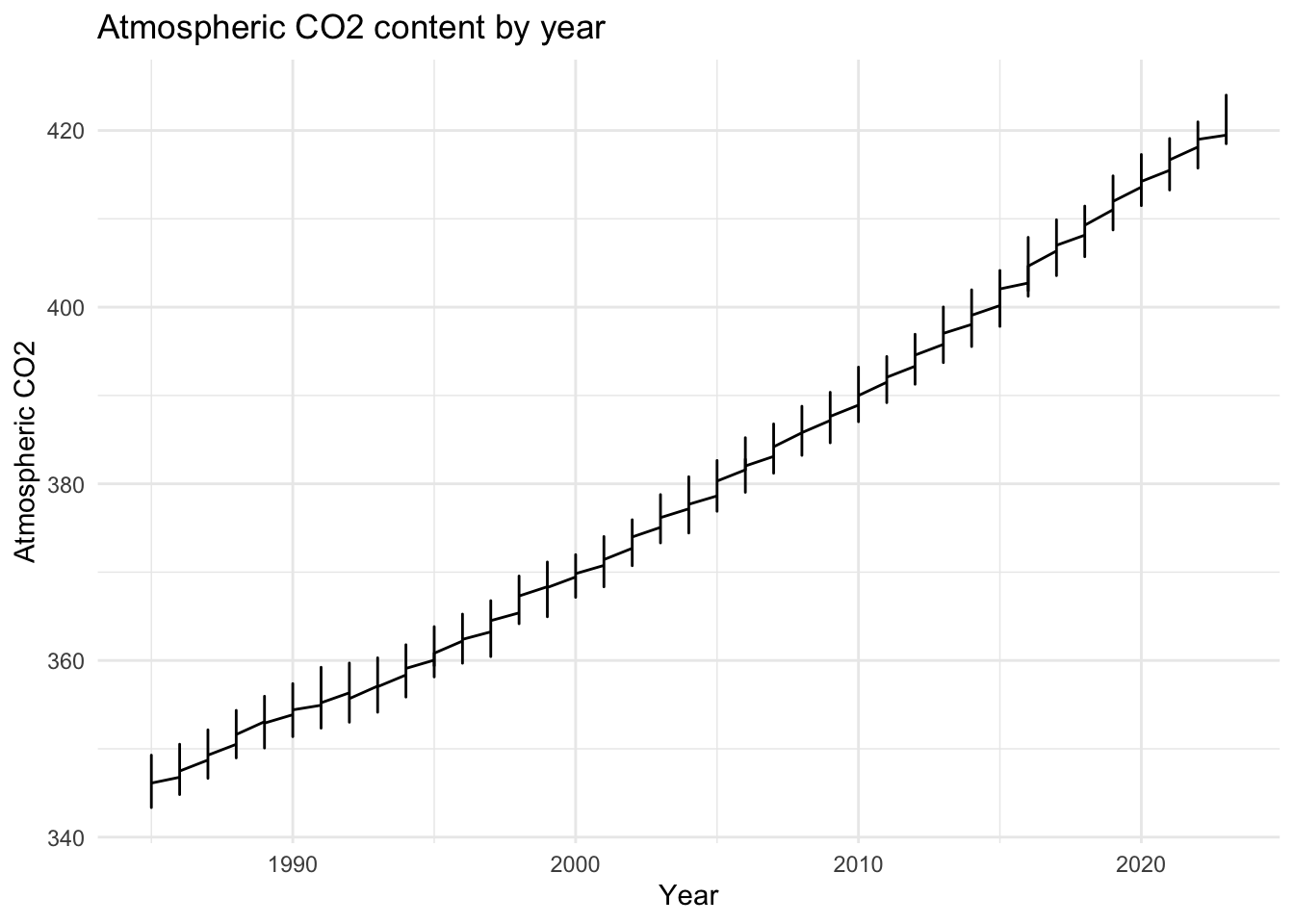
We see from this plot that there is almost an exponential increase in atmospheric CO2 content from the year 1985 to 2023. Although the trends for emissions have not kept up in the same fashion, the amount in the atmosphere has not fallen in the same way.
Next, let’s visualize the precipitation data over our whole time frame. We’ll do this by using the monthly average precipitation we calculated above. The dotted line points out when the blizzard occurred, the highlight date that we created before.
# Plot combined data
ggplot(monthly_avg_combined, aes(x = year_month, y = monthly_avg_precip, color = period)) +
  geom_line() +
  scale_x_date(date_labels = "%b %Y", date_breaks = "18 months") +  # Format x-axis labels
  labs(title = "Monthly Average Precipitation by Period",
    x = "Date",
    y = "Monthly Average Precipitation (mm)",
    color = "Period") +
  theme_minimal() +
  theme(legend.position = "bottom",
        axis.text.x = element_text(angle = 45, hjust = 1)) +
  geom_vline(aes(xintercept = highlight_date), color = "black", linetype = "dashed", size = 0.3)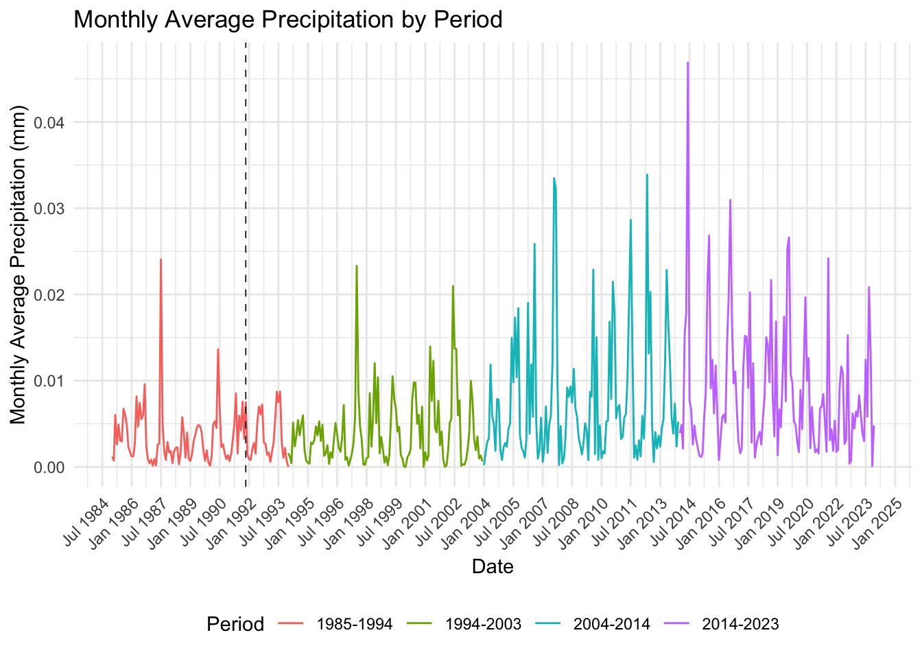
We see from this plot that there is some sort of upward trend in precipitation. Additionally, it seems that months with high precipitation have higher peaks than they used to. In fact, when the blizzard happened, the monthly precipitation was still much lower than months in the 21st century.
Now that we have our preliminary plots, we want to do some analysis with the two data sets together. To do this, we are going to merge the data sets. However, in order to do this, we need to aggregate the precipitation averages again to be yearly averages rather than monthly. We will do this in the same way that we did the monthly averages, but with the year object rather than month. Once we do that, we can join the two data sets on the year column.
#  aggregate the monthly precipitation data to be yearly data so we can merge it with the yearly us emissions data
yearly_avg_precip <- monthly_avg_combined %>%
  mutate(year = as.numeric(format(year_month, "%Y"))) %>%
  group_by(year) %>%
summarize(yearly_avg_precip = mean(monthly_avg_precip, na.rm = TRUE))# merge the us_emissions data and the precipitation data and get rid of the columns we don't need
precip_co2 <- left_join(yearly_avg_precip, co2, by = "year") %>%
select(year, yearly_avg_precip, average)In order to visualize the relationship between the yearly average precipitation and atmospheric CO2, we need to use a gamma regression rather than the classic linear regression. Gamma regression is commonly used in distributions where the variable cannot be negative, like our precipitation data. A linear regression model assumes that the disturbances or errors are normally distributed around zero, which is impossible for our model.
# Gamma regression
gamma_model <- glm(yearly_avg_precip ~ average, data = precip_co2, family = Gamma(link = "log"))
summary(gamma_model)
Call:
glm(formula = yearly_avg_precip ~ average, family = Gamma(link = "log"),
    data = precip_co2)

Coefficients:
              Estimate Std. Error t value Pr(>|t|)
(Intercept) -1.144e+01  2.032e-01  -56.28   <2e-16 ***
average      1.643e-02  5.341e-04   30.77   <2e-16 ***
---
Signif. codes:  0 '***' 0.001 '**' 0.01 '*' 0.05 '.' 0.1 ' ' 1

(Dispersion parameter for Gamma family taken to be 0.06652693)

    Null deviance: 91.015  on 467  degrees of freedom
Residual deviance: 33.274  on 466  degrees of freedom
AIC: -4794.3

Number of Fisher Scoring iterations: 5
Now that we’ve run our model, let’s see what it looks like visually.
# Plot the data with regression line
ggplot(precip_co2, aes(x = average, y = yearly_avg_precip)) +
  geom_point() +
  geom_smooth(method = "glm",
              method.args = list(family = Gamma(link = "log")),
              se = FALSE,
              color = "blue") +
  labs(title = "Relationship between Atmospheric CO2 and Precipitation",
    x = "Atmospheric CO2",
    y = "Yearly Average Precipitation (mm)") +
  theme_minimal()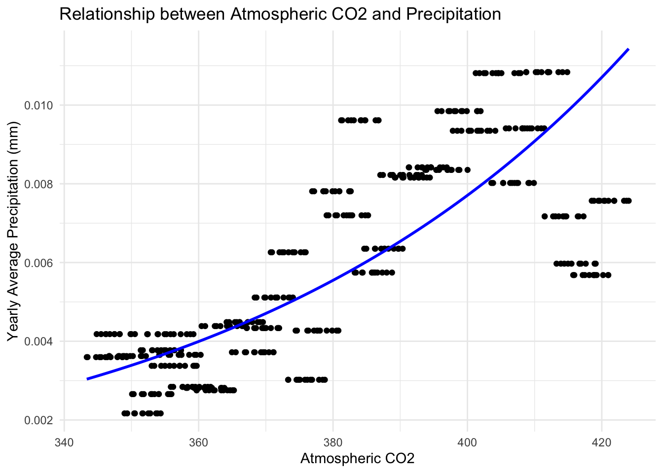
The model seems to fit our data very well. The trend seems to support our initial hypothesis from the very beginning: that an increase in atmospheric CO2 content would be correlated to an increase in precipitation events.
Now that we have our model, we will utilize hypothesis testing to evaluate how much we can rely on this model. To hypothesize on our gamma model, we will begin by formulating null and alternate hypotheses. The null hypothesis (or H0) is that there is no relationship between atmospheric CO2 and precipitation. The alternative hypothesis (or H1) is that there is a significant relationship between atmospheric CO2 and precipitation.
# Gamma regression
gamma_model <- glm(yearly_avg_precip ~ average, data = precip_co2, family = Gamma(link = "log"))
results <- tidy(gamma_model)
results$p.value <- sprintf("%.15f", results$p.value)results %>%
kable("html", caption = "Regression Model Results") %>%
kable_styling(bootstrap_options = c("striped", "hover", "condensed"), full_width = FALSE)| term | estimate | std.error | statistic | p.value |
|---|---|---|---|---|
| (Intercept) | -11.4392318 | 0.2032374 | -56.28508 | 0.000000000000000 |
| average | 0.0164338 | 0.0005341 | 30.77173 | 0.000000000000000 |
As we look at the results from the the gamma model, our p value is 0.000… Above, we have the p value rounded to 15 decimal points, for simplicity’s sake. I did have it previously rounded to 30 decimal points, and still they remained at zero. Therefore, with a p value of 0, which is less than 0.05, we can reject the null hypothesis. This tells us that there is a significant relationship between atmospheric CO2 content and average precipitation.
confint(gamma_model) 2.5 % 97.5 %
(Intercept) -11.8555695 -11.02272832
average 0.0153399 0.01752871When we run our confidence interval for the intercept, we get [-11.85554125 -11.02269481] (for a 2.5%/97.5% split). This means that we can be 97.5% sure that the true intercept falls within that range. More importantly for our CO2 variable we get [0.01533981 0.01752864]. This means that we are 97.5% confident that the true value for our gamma regression falls within that range. While that range is higher than zero, it still does fall below that 0.05 range, giving us further confidence in our model.
While this analysis does take an in depth look into precipitation trends in the last 30 years in the Minneapolis, Saint Paul area as it relates to climate change, there are a couple of additions to the study that could be a great jumping off point for further research. To begin, climate change by nature is a study best done in the long term. When you look too microscopically at weather trends, they are simply that: weather, not climate. On that note, doing this analysis on a larger time scale might allow for more nuance in the results. Additionally, it is difficult to get a measure of these high intensity storm events specifically without simply looking at average precipitation, as I did here. Perhaps future studies could look at those events more specifically within these trends. Lastly, adding another geographic element could be an interesting avenue to explore. Minnesota is near and dear to my heart, which is why I chose it. I would be interested, however, to see how these trends might differ across the country and even the world.
Chavez, A., & Jansen, J. (2021). hockeystick: Simple tools for creating hockey stick plots. Comprehensive R Archive Network (CRAN). https://cran.r-project.org/web/packages/hockeystick/readme/README.html
Doyle, A. (2021, October 29). Remembering the 1991 Halloween blizzard. TwinCities.com. Retrieved December 10, 2024, from https://www.twincities.com/2021/10/29/remembering-the-1991-halloween-blizzard/
National Oceanic and Atmospheric Administration. Search for climate data. National Centers for Environmental Information. https://www.ncdc.noaa.gov/cdo-web/search
University of Virginia Library. Getting started with Gamma regression. University of Virginia Library. https://library.virginia.edu/data/articles/getting-started-with-gamma-regression
@online{peterson2024,
  author = {Peterson, Liz},
  title = {Analyzing Weather Trends in {Minnesota}},
  date = {2024-12-13},
  url = {https://egp4aq.github.io/posts/2024-12-10-msp-weather},
  langid = {en}
}